
Jayzhushi's Utilities
Jan 26, 2024
This post is used to share a few examples of components I used while building jayzhushi.com, they are:
Sound Button
Magic Hover
Layout Switch
Horizontal Scroll (Responsive)
Back to top (with delay)
Page Transition (deprecated)
See the Demo and Remix:
See the Demo Site | Remix Link
Sound Button
This case shows playing a sound for any button on hover or click, in addition to providing a switch to control whether the sound is enabled or not.
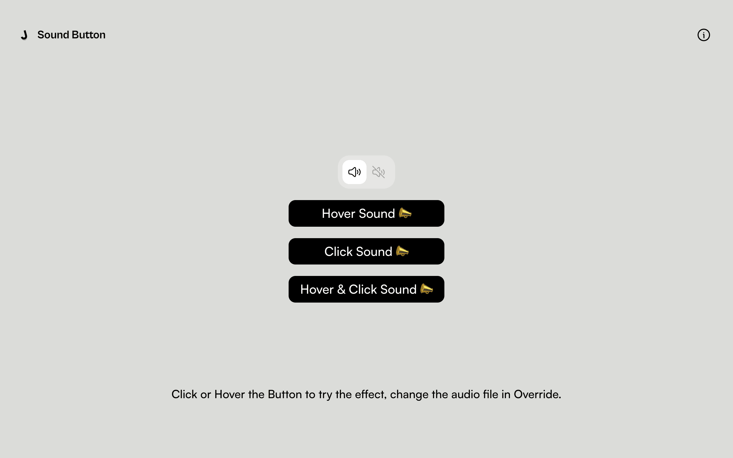
Actions are assigned in the Overrider according to the specific use case.
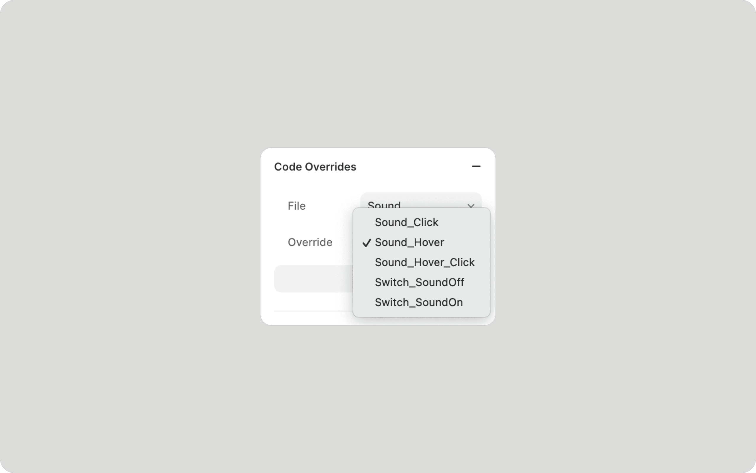
In the Sound.tsx file, you can modify the audio file by editing the contents of the sound. In general, you can either get the download link directly from the audio website and copy it here, or you can upload the audio file to Github or cloud storage and get the link to the resource.

Magic Hover
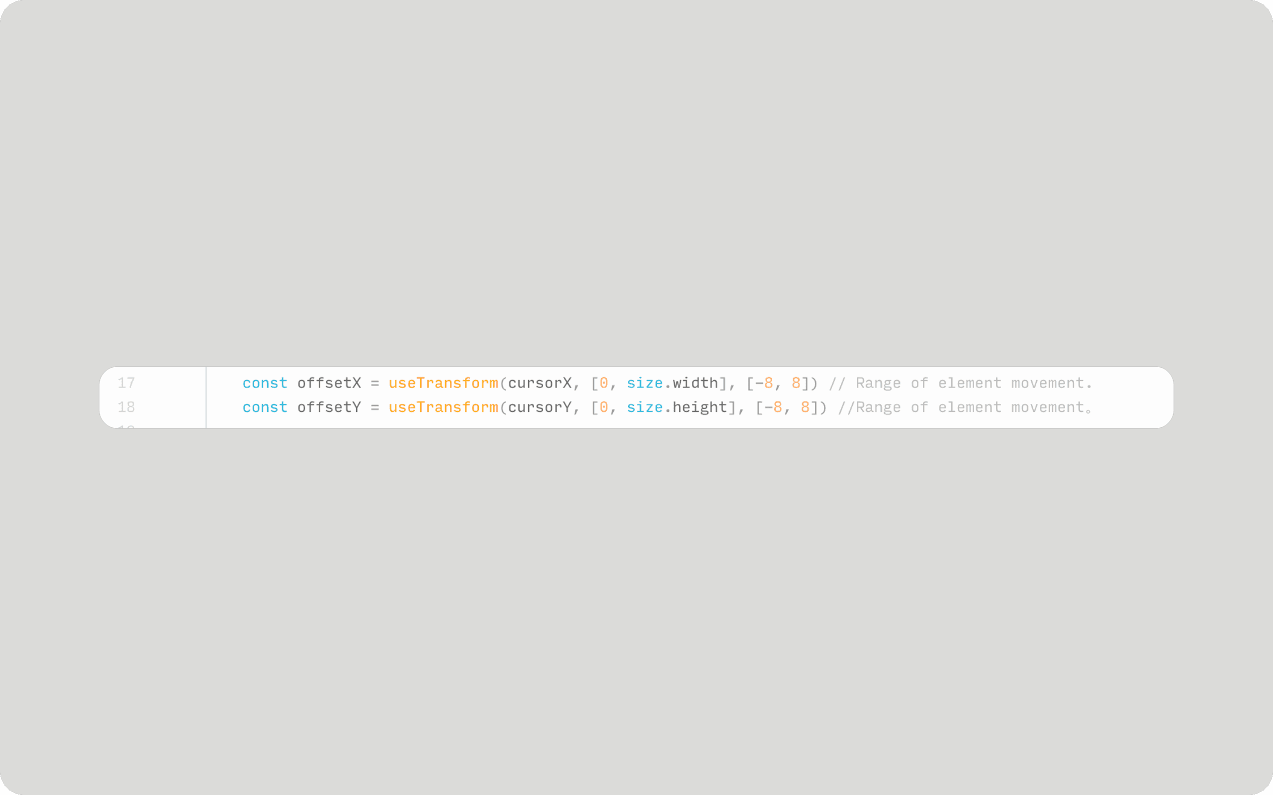
The magnetic effect on pointer hover is very popular, and this Override code automatically gets the dimensions of the element being used and adds the effect.

In the Override file Effect - MagicHover, find the line with offsetX and offsetY. Where [-8, 8] means the element can move 8 pixels (up, down, left, right) when hovering.
Layout Switch
When building jayzhushi.com, I particularly liked the horizontal scrolling. However, in order to make the site more inclusive, I offered the solution of layout switching.
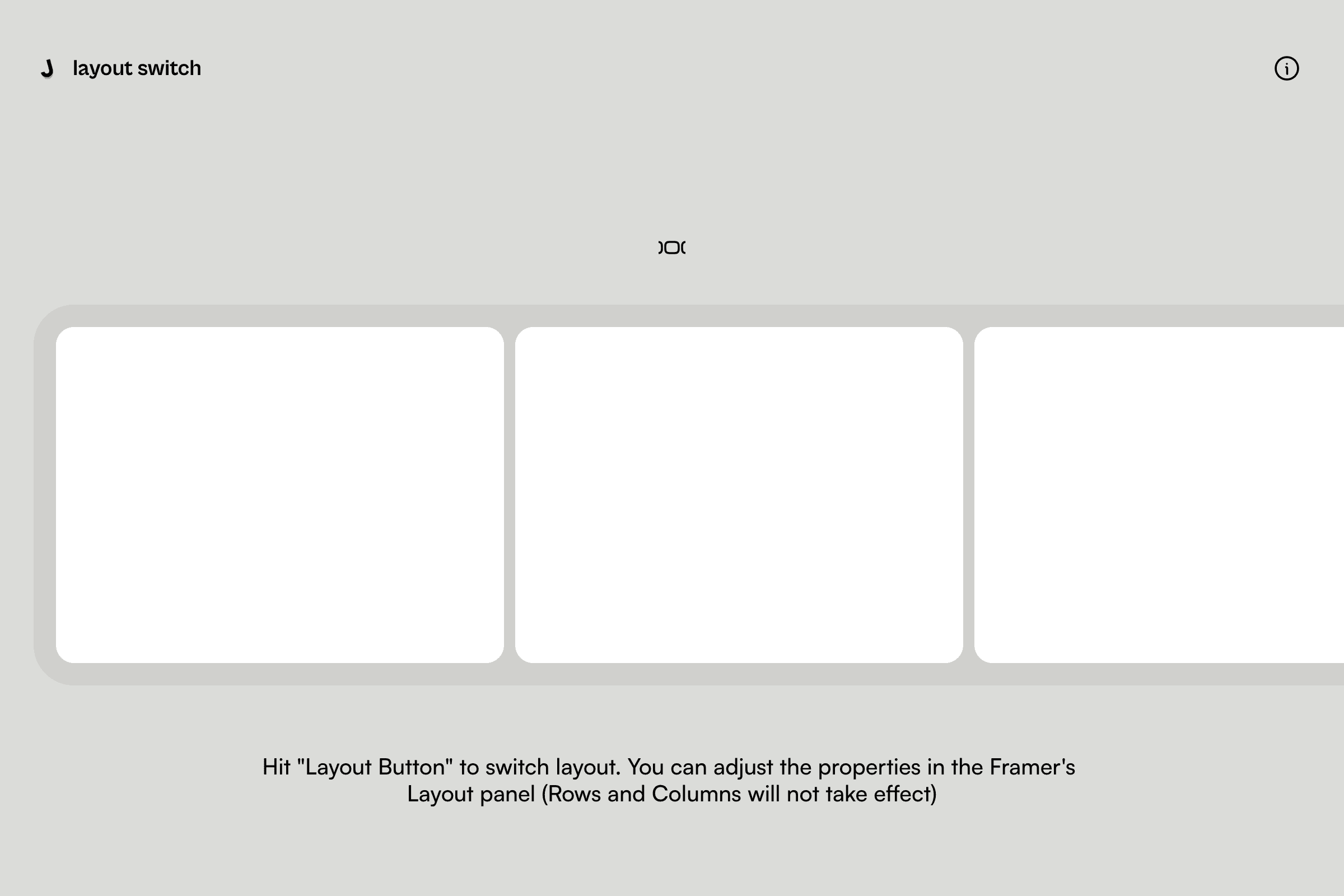
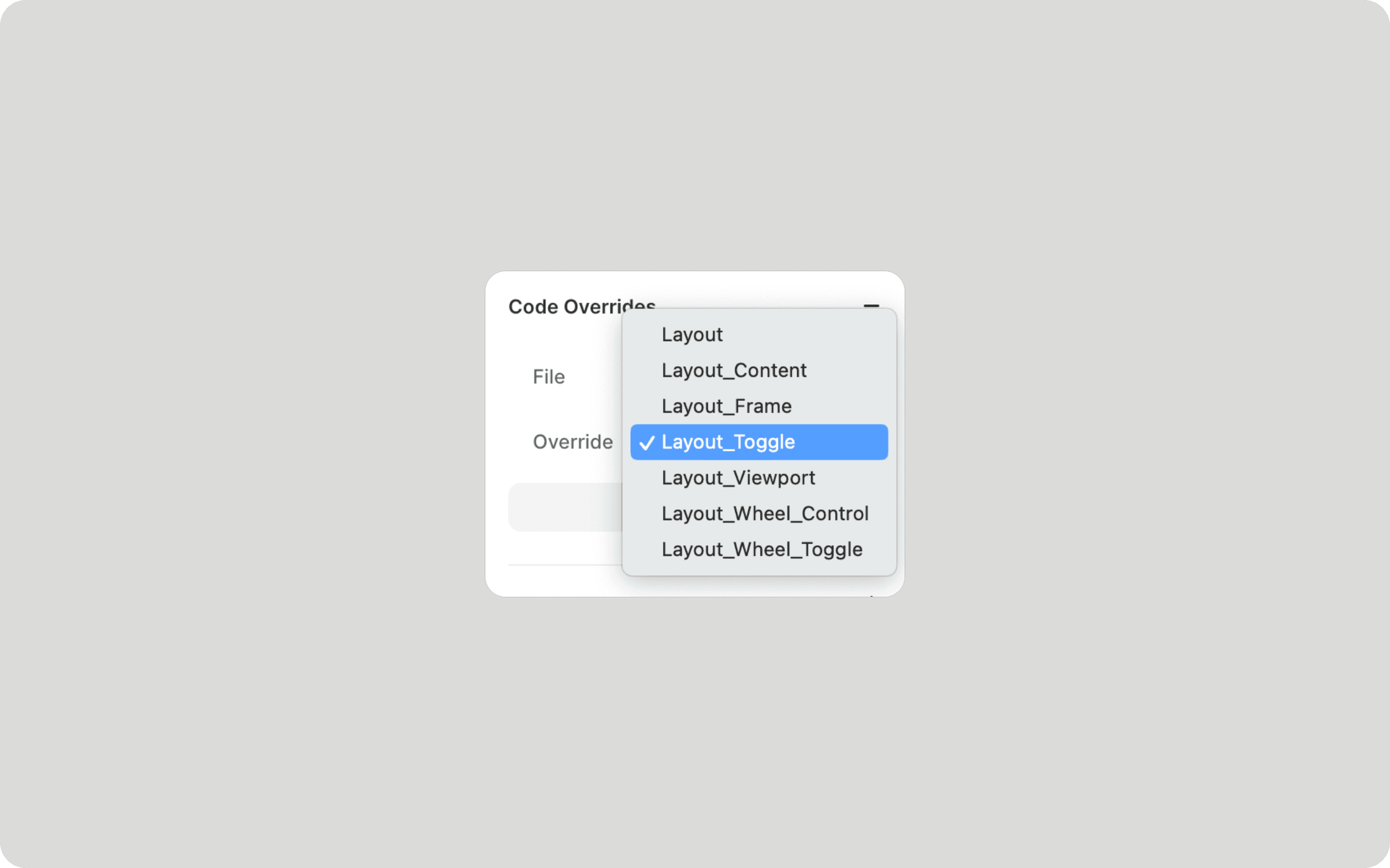
In Override, I use Layout for the elements within the grid to make sure they animate when switching layouts, Layout_Frame for the grid itself, and Layout_Viewport for the grid's parent layer, which controls the grid's transition from left to center. Finally, Layout_Toogle is used for the buttons that control the grid transition.
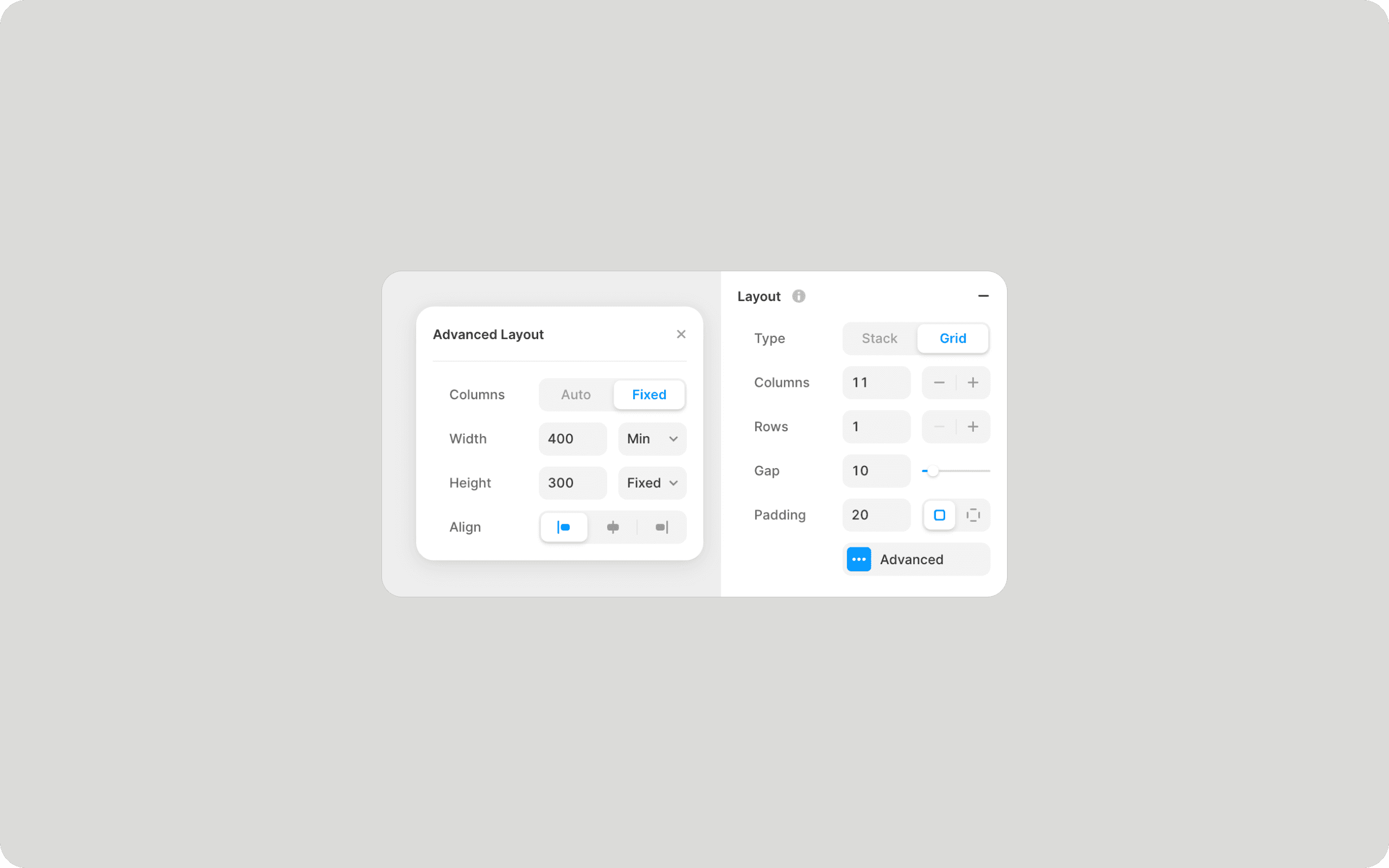
When using this Override file, you can still adjust the properties in the Layout panel of the Framer (row and column properties will not take effect). In Advanced, use Width and Height to control the size of your content.
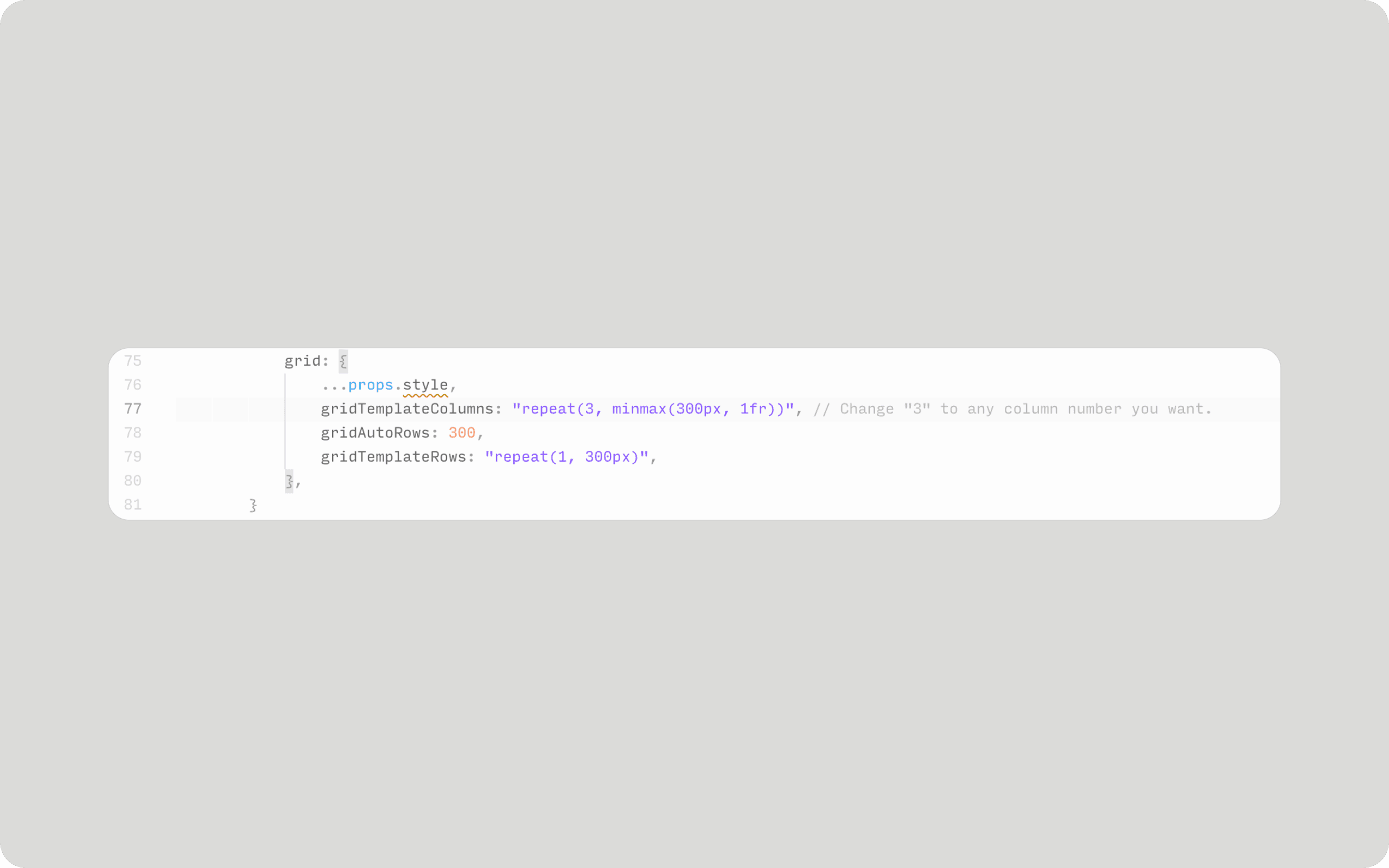
If you want to adjust the number of columns in the grid, modify the Layout_Frame component in Layout.tsx. Find the gridTemplateColumns in the grid and change the number after repeat(.
Horizontal Scroll (with wheel)
This case allows you to control the horizontal scrolling layout using only the mouse wheel. Please note that this effect is still experimental.

Add Override - Layout_Wheel_Control to any layer that needs to use this effect, usually this layer will also have an Overflow: Scroll attribute, and Layout_Wheel_Toggle will be used to toggle this on and off.
Note that if you use this case with layout switching, then you need to deactivate this feature when switching to normal vertical layout, otherwise it may affect the normal scrolling effect.
Also, while it is possible to use a Scroll Transform in Framer to achieve the same effect (use the wheel to control the x value of the layer), this may result in ineffective finger swipes on a trackpad or touchscreen, so I chose to use Overflow-X: Scroll, and optimize for scroll wheels.My idea is providing a responsive interaction solution that automatically selects the scrolling controls based on the input device. In the latest version of jayzhushi.com, this solution will be enabled by default on Windows.
Back to top (with soomth delay)
The case provides a button component that smoothly scrolls the page to the top when clicked. And the button can be set with a delay time to play an animation. The case provides Code Component and Override.

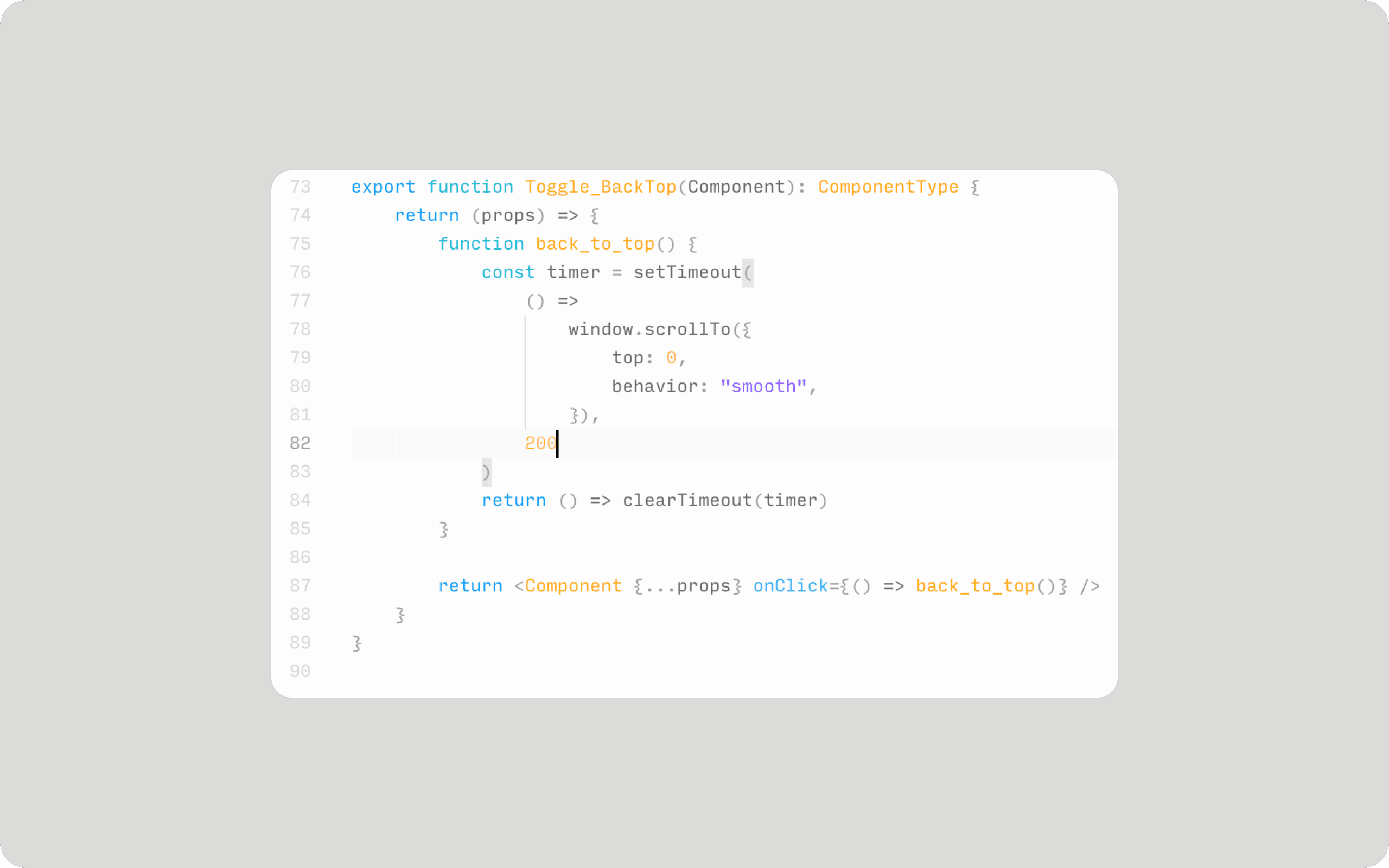
If the button component is responsive, then using Override (Effect-Toggle_BackTop) would be a better choice. Just change the number 200 in the code to the number you want, in milliseconds.
Page Transition (deprecated)
The last case is about page transitions. I used an old Framer feature to add a delay before jumping to another page, during this time some exit animations can be added to the element.
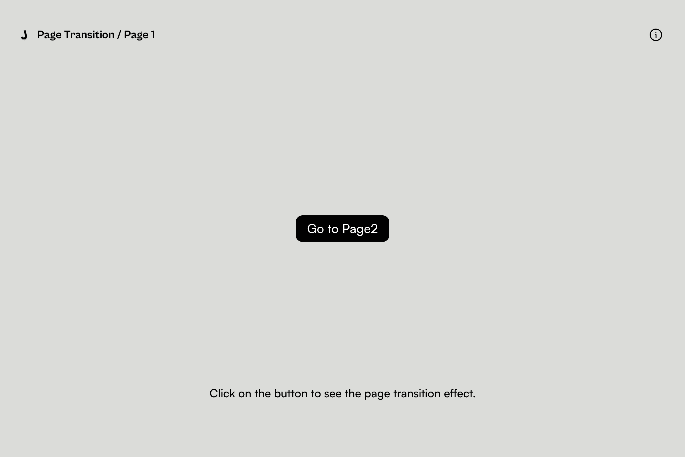
In older versions of Framer, Frames were able to add a delay time when adding an interaction event, but this feature is now deprecated. By placing a button or link in this Frame and adding a delay time, all we need to do is add an animation that plays within that time.

In Override, we apply Transition_Elements to elements that need to play an exit animation and Transition_Toggle to links or buttons.

In Page_Transition.tsx, you need to make sure that the delay time in setTimeout is close to the time of the link (usually a bit longer), which ensures that the elements on the next page are displayed properly (if the exit animation is used).
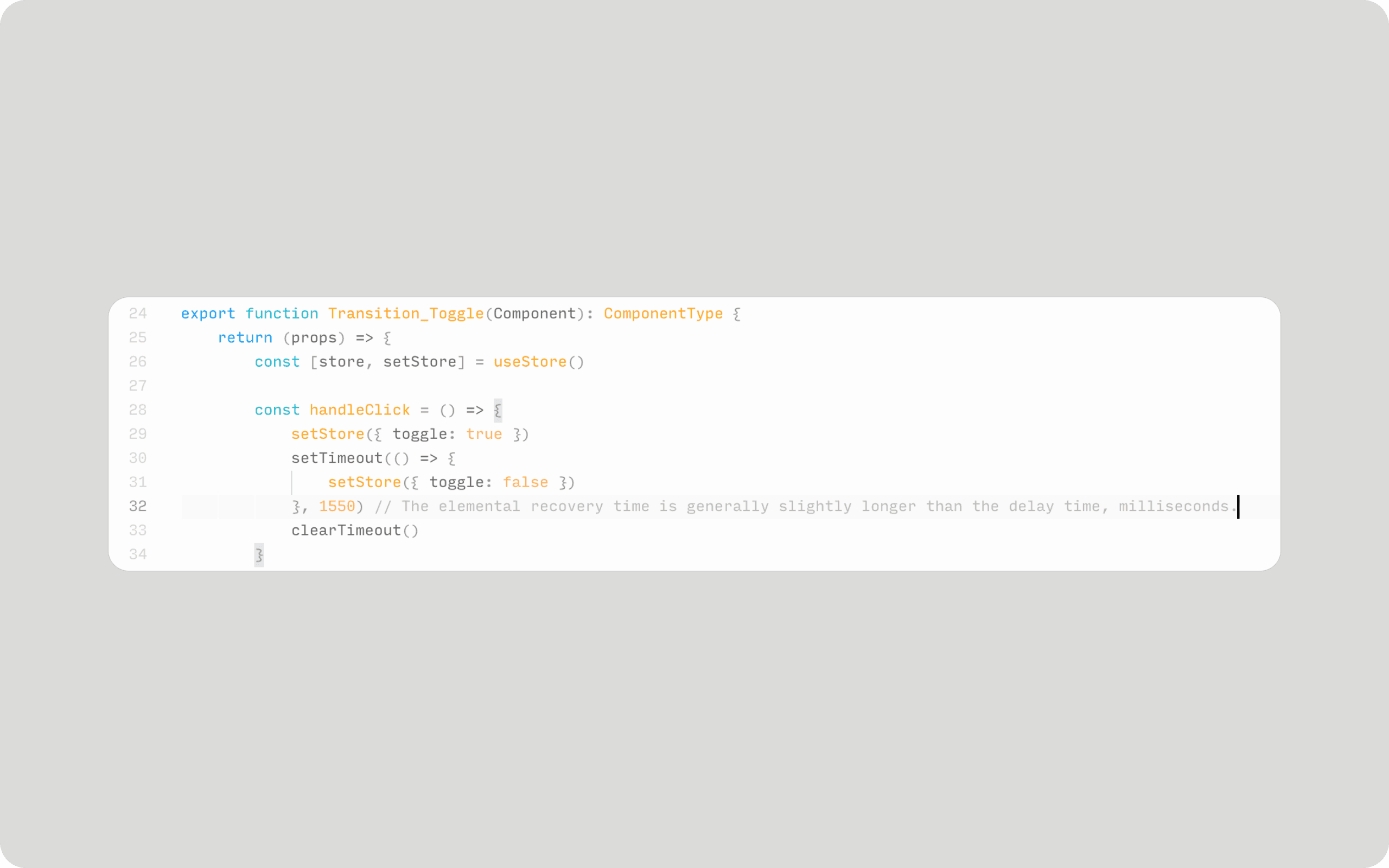
Framer updated the page transition feature when I built the site, so I don't recommend adding an exit effect this way anymore, as it's troublesome and leads to errors.
At the end
I used to research many conceptual effects in my daily work, which were filtered and used in my personal website. However, these effects are realized in an unprofessional way, which may cause you to encounter some errors when using the above examples. If you are a React expert and have a better approach, please feel free to talk to me.
Content
Jayzhushi's Utilities
Jan 26, 2024
This post is used to share a few examples of components I used while building jayzhushi.com, they are:
Sound Button
Magic Hover
Layout Switch
Horizontal Scroll (Responsive)
Back to top (with delay)
Page Transition (deprecated)
See the Demo and Remix:
See the Demo Site | Remix Link
Sound Button
This case shows playing a sound for any button on hover or click, in addition to providing a switch to control whether the sound is enabled or not.
Actions are assigned in the Overrider according to the specific use case.
In the Sound.tsx file, you can modify the audio file by editing the contents of the sound. In general, you can either get the download link directly from the audio website and copy it here, or you can upload the audio file to Github or cloud storage and get the link to the resource.
Magic Hover
The magnetic effect on pointer hover is very popular, and this Override code automatically gets the dimensions of the element being used and adds the effect.
In the Override file Effect - MagicHover, find the line with offsetX and offsetY. Where [-8, 8] means the element can move 8 pixels (up, down, left, right) when hovering.
Layout Switch
When building jayzhushi.com, I particularly liked the horizontal scrolling. However, in order to make the site more inclusive, I offered the solution of layout switching.
In Override, I use Layout for the elements within the grid to make sure they animate when switching layouts, Layout_Frame for the grid itself, and Layout_Viewport for the grid's parent layer, which controls the grid's transition from left to center. Finally, Layout_Toogle is used for the buttons that control the grid transition.
When using this Override file, you can still adjust the properties in the Layout panel of the Framer (row and column properties will not take effect). In Advanced, use Width and Height to control the size of your content.
If you want to adjust the number of columns in the grid, modify the Layout_Frame component in Layout.tsx. Find the gridTemplateColumns in the grid and change the number after repeat(.
Horizontal Scroll (with wheel)
This case allows you to control the horizontal scrolling layout using only the mouse wheel. Please note that this effect is still experimental.
Add Override - Layout_Wheel_Control to any layer that needs to use this effect, usually this layer will also have an Overflow: Scroll attribute, and Layout_Wheel_Toggle will be used to toggle this on and off.
Note that if you use this case with layout switching, then you need to deactivate this feature when switching to normal vertical layout, otherwise it may affect the normal scrolling effect.
Also, while it is possible to use a Scroll Transform in Framer to achieve the same effect (use the wheel to control the x value of the layer), this may result in ineffective finger swipes on a trackpad or touchscreen, so I chose to use Overflow-X: Scroll, and optimize for scroll wheels.My idea is providing a responsive interaction solution that automatically selects the scrolling controls based on the input device. In the latest version of jayzhushi.com, this solution will be enabled by default on Windows.
Back to top (with soomth delay)
The case provides a button component that smoothly scrolls the page to the top when clicked. And the button can be set with a delay time to play an animation. The case provides Code Component and Override.
If the button component is responsive, then using Override (Effect-Toggle_BackTop) would be a better choice. Just change the number 200 in the code to the number you want, in milliseconds.
Page Transition (deprecated)
The last case is about page transitions. I used an old Framer feature to add a delay before jumping to another page, during this time some exit animations can be added to the element.
In older versions of Framer, Frames were able to add a delay time when adding an interaction event, but this feature is now deprecated. By placing a button or link in this Frame and adding a delay time, all we need to do is add an animation that plays within that time.
In Override, we apply Transition_Elements to elements that need to play an exit animation and Transition_Toggle to links or buttons.
In Page_Transition.tsx, you need to make sure that the delay time in setTimeout is close to the time of the link (usually a bit longer), which ensures that the elements on the next page are displayed properly (if the exit animation is used).
Framer updated the page transition feature when I built the site, so I don't recommend adding an exit effect this way anymore, as it's troublesome and leads to errors.
At the end
I used to research many conceptual effects in my daily work, which were filtered and used in my personal website. However, these effects are realized in an unprofessional way, which may cause you to encounter some errors when using the above examples. If you are a React expert and have a better approach, please feel free to talk to me.
Content
@2025 THE STAGE FOR JAY JI.
- 0
- 1
- 2
- 3
- 4
- 5
- 6
- 7
- 8
- 9
- 0
- 1
- 2
- 3
- 4
- 5
- 6
- 7
- 8
- 9
@2025 THE STAGE FOR JAY JI.
- 0
- 1
- 2
- 3
- 4
- 5
- 6
- 7
- 8
- 9
- 0
- 1
- 2
- 3
- 4
- 5
- 6
- 7
- 8
- 9
@2025 THE STAGE FOR JAY JI.
- 0
- 1
- 2
- 3
- 4
- 5
- 6
- 7
- 8
- 9
- 0
- 1
- 2
- 3
- 4
- 5
- 6
- 7
- 8
- 9
@2025 THE STAGE FOR JAY JI.
- 0
- 1
- 2
- 3
- 4
- 5
- 6
- 7
- 8
- 9
- 0
- 1
- 2
- 3
- 4
- 5
- 6
- 7
- 8
- 9
@2025 THE STAGE FOR JAY JI.
- 0
- 1
- 2
- 3
- 4
- 5
- 6
- 7
- 8
- 9
- 0
- 1
- 2
- 3
- 4
- 5
- 6
- 7
- 8
- 9